How to Style a Picture Ledge
I built and hung this picture ledge in our living room about a year and a half ago. It was the perfect solution for the big, blank space above our sofa and I have really loved having it.
But, if I’m being honest, it’s been really (really!) stagnant for quite some time. I’ve made a couple of small changes here and there, but the beauty of an art ledge is that you can change it up anytime you want. I definitely haven’t been doing that!
You’ve already seen the new look on my paint by number post earlier this week, but I wanted to dedicate a post to the art ledge itself! You’ll notice the paint by number isn’t in these photos – I snapped them before I put it up.
I was sent some art by Minted for Grant’s gallery wall, and while I was ordering, I grabbed some stuff for in here too. It only took me a few minutes to switch things up, and I love how it turned out!
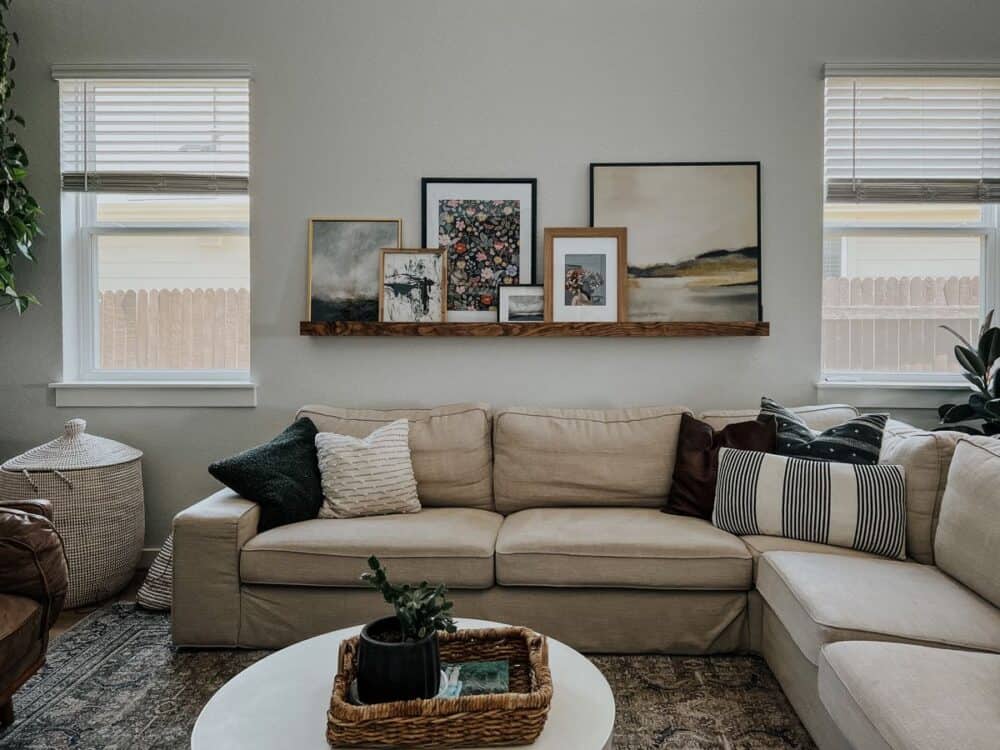
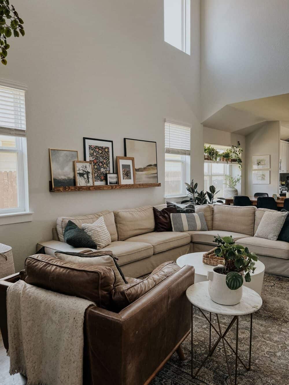
Art is still something I’m learning how to choose and style in my home. It’s a really personal thing to be picking out, and everyone will have wildly different opinions on it. But, I thought it would be worth taking a minute to walk you through my own process for picking out art. And, of course, I’ll share a few tips and tricks for styling a picture ledge.
how i choose art for our picture ledge
First of all, let me say that there’s absolutely no right and wrong way to choose art. It’s an incredibly personal decision and what speaks to one person might not speak to another.
I find that when choosing art, the most important thing I need to remember is to follow my gut. Sometimes I can’t explain why a certain piece of art is one that I want in my home, but I almost always know it when I see it.
When I’m choosing art online, I’ll simply open up a category and start browsing. I tend to gravitate towards paintings or sketches rather than photography, and I like to narrow it down to a specific style. My own personal art style lands mostly in the “Traditional” and “Vintage” categories, but I’ve found some really gorgeous pieces from the “Modern” section as well so I never ignore it.
Once you’ve got a category of art pulled up, just start browsing! Try not to overthink it. When I’m shopping for art online, I’ll just open a bunch of things that I gravitate towards in new tabs. Then, once I’m done browsing I’ll go back and narrow it down.
Sometimes I like a specific piece of art because it reminds me of something. I have purchased art pieces that reminded me of old places we lived, paintings my grandmother did, and more. Even if it’s a loose comparison, I always find myself drawn to art that makes me remember something.
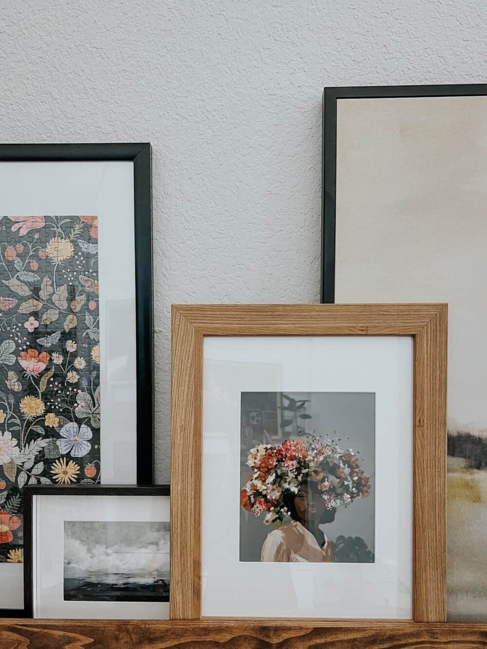
Sometimes, there isn’t anything it reminds me of, but it just makes me feel something. For example, every time I passed by the woman in the print above, I would just stop and stare. There was something about her that really drew me in, and I couldn’t stop thinking about how much I loved the colors and the movement and the look on her face.
I don’t have any particular ties to that piece or any real reason I needed it…but I needed it.
All that to say – choosing art is incredibly subjective and I don’t have any hard and fast rules for you. Because…there are none! The biggest thing to remember is to trust what your heart tells you. Remember that if you love it, you don’t need to have a reason. Just trust that feeling and try it out.
styling a picture ledge
Now, let’s chat a little about how I styled the picture ledge in our living room. I do have a little more concrete guidance for you here!
The first thing to consider when you’re choosing art and styling your ledge is height. We have 18-foot ceilings in here, and this picture ledge is the only thing on the wall aside from the windows. So, I need the art to really make an impact!
I have this large landscape print that has been a staple of the art ledge from the beginning – it’s the largest piece of art I own. It adds some much-needed height, and anytime I try to style the ledge without it, things feel off-balance.
I also find that this piece only looks right if it’s styled exactly in this spot on the ledge. When I try pushing it to the other side, it throws the balance off. We have our floating shelves on the other side of the room. So, when I add the large painting right next to them, that side of the room is much heavier visually than the other.
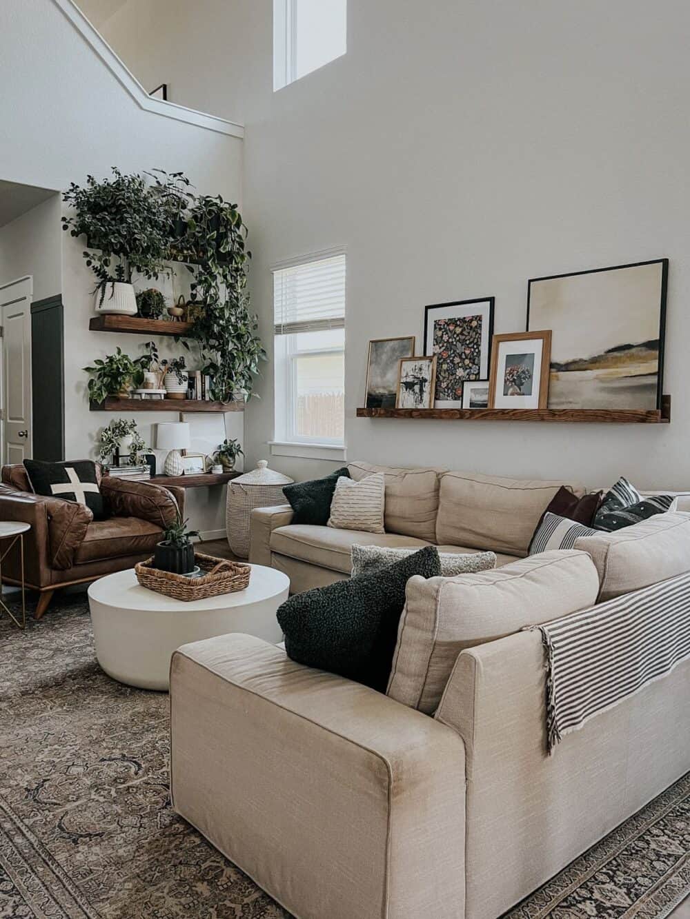
The only way you’ll figure out that sort of thing is through trial and error! I recommend you start with the biggest pieces you have when styling a picture ledge. They’re the ones that will make the most impact, and getting their placement right sets the rest up for success!
After I get my biggest pieces up, I start layering in the rest. I like to have all of my pieces overlap each other slightly. It helps them feel connected to each other, and more like one big display. If you just set the art side by side along the picture ledge, it’s more likely to feel disjoined and less intentional.
As you’re layering in the art, consider how the subjects, colors, and styles of the pieces work together. I have a really solid mix of traditional and more modern pieces in here, and I try to spread them out so they’re not all clustered. Again – you want it to flow and feel intentional! If you have all the modern pieces in one area and the more traditional ones in another, it won’t feel right.
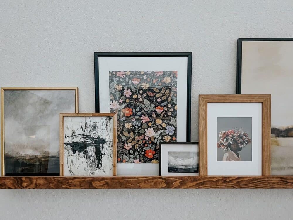
Finally, I think a picture ledge looks best with a variety of sizes and orientations! I use mostly larger photos in mine because of the scale of the room. But, it looks best when I also sprinkle in a smaller piece or two to balance things out.
Of course, you might not get it right on your first time. Or even the second or third. Much like learning how to style shelves, styling a picture ledge takes a lot of trial and error. The more you play around with it, the better you’ll get!
sources + other art I love
Below, I’ll link all of the art pieces from our ledge, along with a few other things I’m loving lately – at every price point!
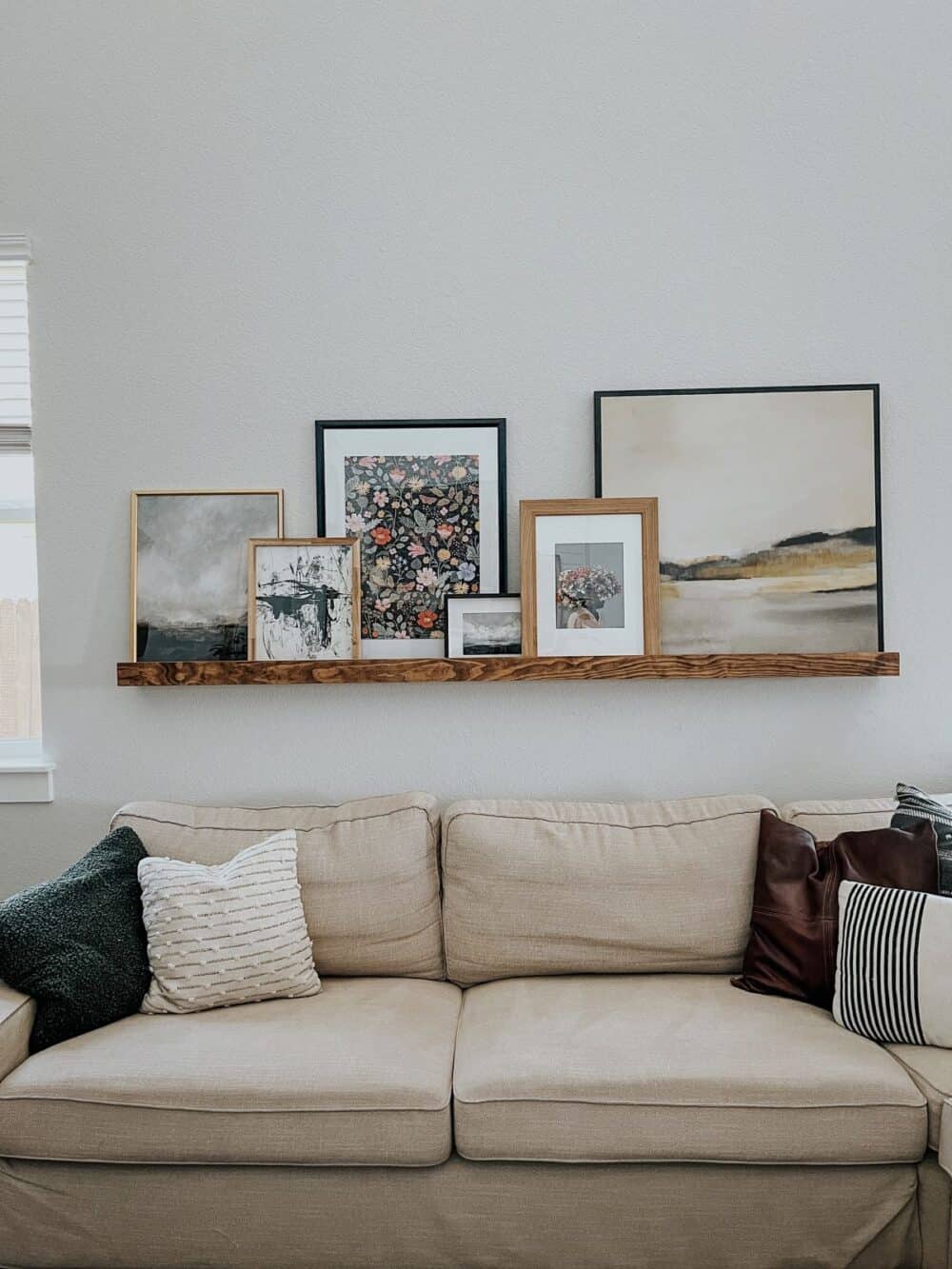
(From left to right)
- “Riley” Landscape Painting
- “Tour de Force II” Modern Print
- Rifle Paper Co. Puzzle
- “Winter Bluff” Landscape Painting
- “Paramount” Painting
- “Morning Beach” Wall Art
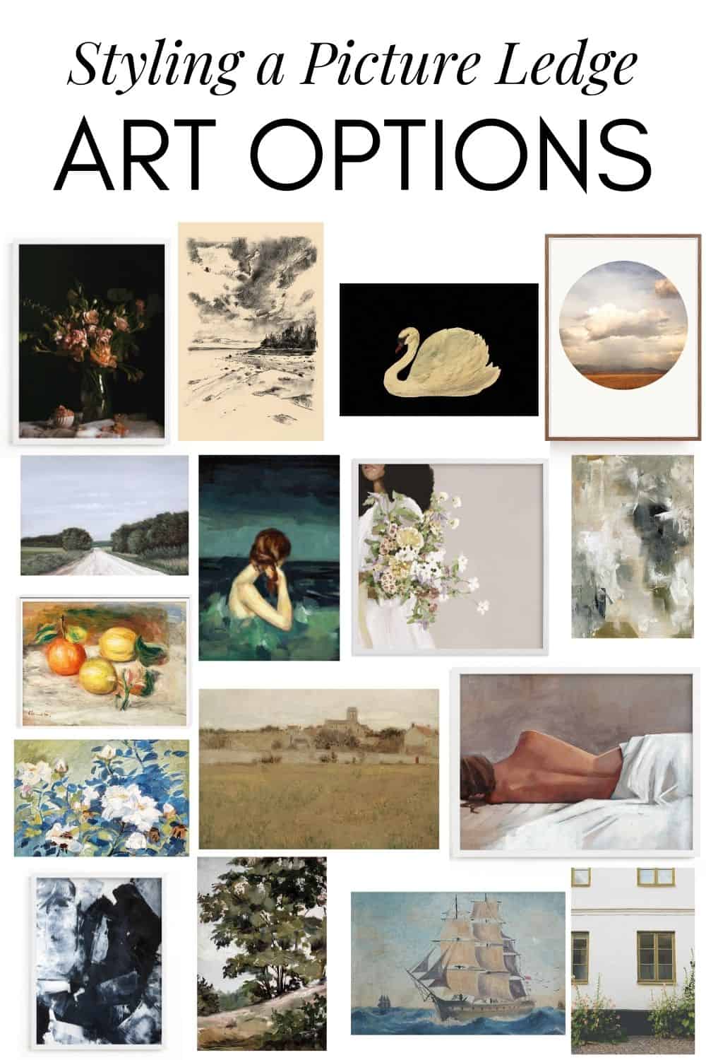
And a few other favorites…

Looks great! What are the dimensions of the frames you used? I’m trying to style my own shelf and need guidance getting started haha. Thanks!
They range from 30″ x 30″ all the way down to 5X7! I think ANY size works, but a variety is best! Also, if you’ve got tall ceilings like mine, a few bigger pieces are KEY!
The artwork corner that you designed is quite stunning! I am fascinated by these pictures.