The Best Blue Gray Paint Colors
Blue has always been one of my very favorite colors to use in my home. In the last few years I’ve trended towards more greens but if I look back at aaaaall of our houses and the spaces I’ve done, blue is by far the most used color! I’ve always leaned towards more saturated or dark blues, but a color I’m really really loving lately is a more subtle blue gray paint color.
I really wanted to do a dusty blue gray on the walls of our powder room when I painted it in December, but due to some negotiating with Corey we ended up with a darker blue. And we both agreed it was all wrong for the space almost immediately! So…I repainted in a beautiful light blueish gray and…well…it’s perfect.
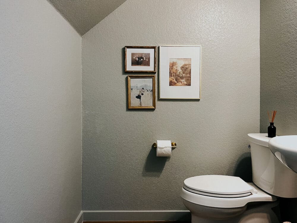
For our powder room, I went with Motor City by Clare. They sent me the paint and some painting tools so I could transform the room, and I’m so grateful! They’re truly one of the best paint brands out there, and I’m finding myself using them more and more lately.
Let’s talk about this beautiful trending color a bit more and how you can use it in your home, shall we?
Blue Gray or Gray Blue…What’s the Difference?
Let’s start here – sometime’s you’ll see “blue gray” and sometimes you’ll see “gray blue”. Are they the same? What’s the difference?
Generally speaking, you should list the dominant color first. So, in the case of our powder room, it’s a gray blue paint color. Meaning, there’s more gray than there is blue.
Warm Grey vs. Cool Grey
One thing to consider when choosing a paint color is if you want it to lean more warm or more cool!
Generally speaking, warm colors have undertones that are yellow, orange, and red. Cool colors have undertones that are green, blue, and purple. That doesn’t necessarily mean all blue gray colors are cool, though! If the gray mixed in with the blue has enough yellow in it, it’ll warm the color right up.
The easiest way to tell a difference is to compare them. If you hold two blue-gray colors up next to each other, you should be able to tell which one leans warmer, and which leans cooler.
It’s important to know that light is a major factor, and can affect how the color feels in your space. Everythng from your light bulbs to whether or not you have a lot of natural light is a factor. If you want to know if a color feels warm or cool in your specific space, I recommend sampling it!
Where can you use them?
Blue gray paint colors genuinely can be used anywhere in your home. There are no rules! Here is some inspiration…
- It’s a great accent color! To add blue gray as accents in your home, try it on an island, an accent wall, or the ceiling!
- The laundry room – it’ll make it way more enjoyable to be in there!
- Blue gray is the perfect soothing color for a bathroom.
- Blue gray can be a gorgeous color for cabinets – especially if your countertops are a shade that will really pop against it!
Blue gray is really one of those chameleon colors that changes depending on the room, the time of day, and the lighting. It can be used in any space and will look good with any home decor.
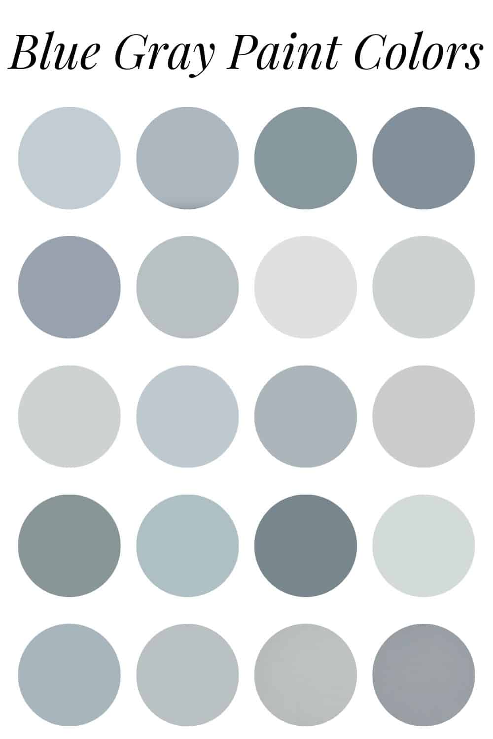
The 20 Best Blue Gray Paint Colors
Here are a few of my favorite blue grays from the various paint brands. There are tons of options out there, but if you ask me, these are the best blue grey paint colors.
Benjamin Moore
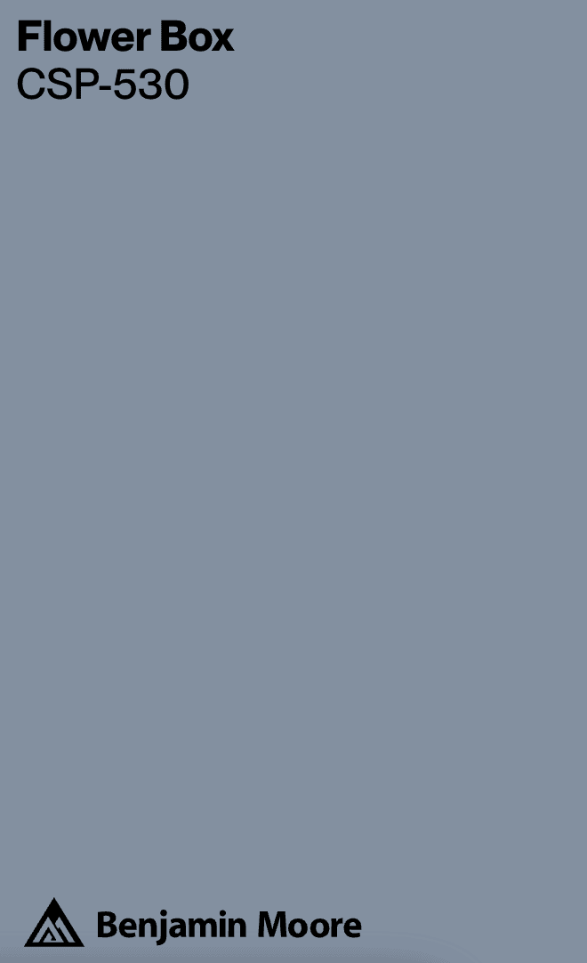
Flower Box (CSP-53)
- This is a mid-tone color, so a bit darker than some. It may lean purple in some lights, as it’s a much more saturated color!
Manor Blue (1627)
- This is a great spa-like blue that is heavier on the gray tones. It’s a mid-tone that is more saturated than some of the others!
Mt. Ranier Gray (2129-60)
- This is an icy blue with gray undertones. It will feel a bit brighter and more “true” blue in some lighting. It may lean a bit pastel, too!
Water’s Edge (1635)
- Benjamin Moore Water’s Edge aaaalmost has some green undertones in it. It’s a gorgeous blue-gray color that will change in different lights.
Mineral Alloy (1622)
- This mid-tone shade is rich and saturated. It’s closer to a navy with less gray tones in it.
Comet (1628)
- This is a great grey paint color with plenty of blue undertones to it.
Other Benjamin Moore Colors…
Benjamin Moore is a really popular brand with a ton of beloved colors. Here are a few other popular blue gray paint colors to check out…
- Benjamin Moore Cloudy Sky
- Benjamin Moore Providence Blue
- Benjamin Moore Hale Navy
- Benjamin Moore Van Courtland Blue
- Benjamin Moore Smoke
Sherwin Williams
Krypton (SW 6247)
- Sherwin Williams Krypton has more of a slate gray feel. It’s a great mid-tone and has a cozy vibe.
Misty (SW 6232)
- This is a really soft gray with blue undertones. It brings a calmness to the space and would be a really beautiful choice for any room.
Rock Candy (SW 6231)
- This color leans towards a white with cool blue undertones. It’s a really light blue-grey color that will feel super neutral.
Upward (SW 6239)
- This is kind of a denim blue with gray undertones. May lean slightly purple in some lights!
Jubile (SW 6248)
- This mid-tone color leans more heavily towards gray, with a strong blue undertone.
Evening Shadow (SW 7662)
- This is a definite gray blue – the main color here is a warm gray, with subtle blue undertones.
Behr
Ozone (PPU13-14)
- Ozone is a really pretty blue with slight gray tones to it. Great for a space where you want it to lean more saturated!
Atmospheric (PPU12-15)
- I love Atmospheric and have seen it used in a lot of beautiful spaces! It has a slight green undertone to it as well, so keep that in mind if you choose it!
Norwegian Blue (N470-5)
- A darker, more saturated blue with gray undertones, this color would be great in a room where you want a bolder vibe.
Urban Mist (PPU12-13)
- This one has some green tones in it, but it’s a really pretty gray blue that will feel bright and airy in your space.
Intercoastal Gray (MQ5-23)
- A more saturated blue tone, this one gives off a definite coastal vibe to me!
Distant Star (MQ5-31)
- This is my favorite of all the Behr gray blue colors. It’s perfectly muted and, in my opinion, the perfect mix of blue and gray!
Clare Paint
Motor City
- This is the color I chose for our powder room! It reads like a really beautiful gray-blue and changes all throughout the day. My favorite kind of color.
Set in Stone
- This reads like a slate gray with some blue undertones. It’s a really gorgeous color that would be great for a bolder space.
Some Painting Tips & Tricks
Before you paint, I always recommend sampling your paint colors on the wall! It’s the best way to ensure you don’t end up with a color that doesn’t work in your space. You can have peel and stick paint samples from almost all paint brands from places like Samplize shipped right to your doorstep if you like, but personally I like to pop in the store and grab a few samples myself!
Once you have a sample, you can paint a swatch on these peel and stick papers, on foam boards, or paint some color swatches right on the wall itself!









This is my favorite color group—reminds me of comfy old blue jeans. Makes me feel instantly relaxed. I always thought when color names were paired, the second one was dominant. Blue gray as blue-ish gray. Doesn’t matter—they’re all lovely!
YES! Such a cozy, comfy color!